An exercise in how visual design can change the user experience in Gmail.
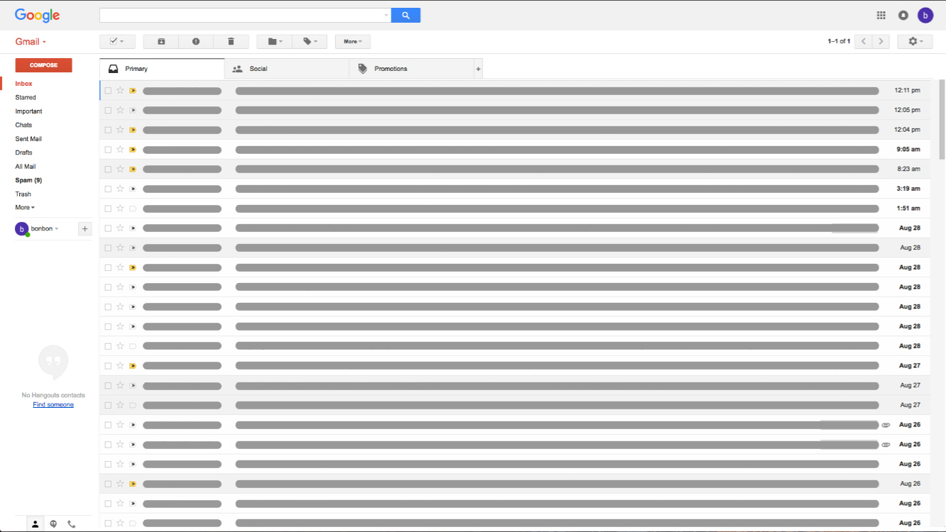
Without having graphically designed an interface before, I thought it would be a good opportunity to try putting the concepts of visual design into practice. My hope was to get an understanding of challenges faced in designing an application visually while also trying to clearly communicate specific information. As suggested by my mentor, Gmail’s interface was the subject for this exercise because of its relatively monochromatic scheme.
Visually enhance the current Gmail interface to show understanding of visual design principles from the book About Face to communicate specific information.
Here were several aspects that I thought of considering and designing for.
Color
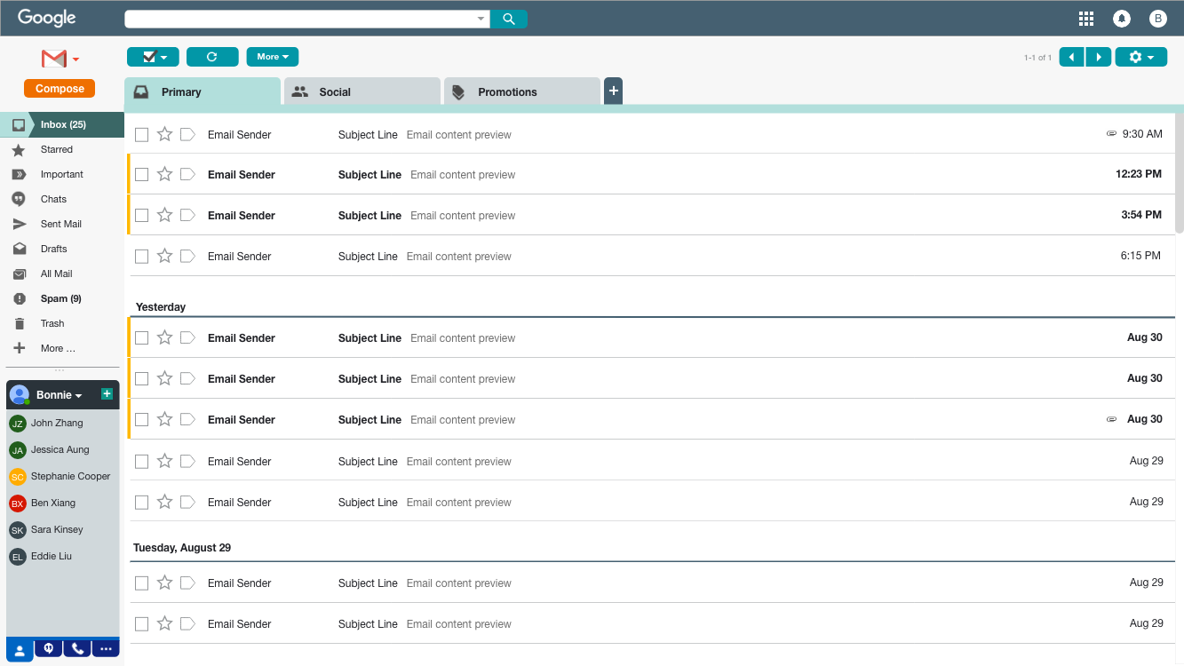
This was one of the tougher aspects for me. How do I incorporate more color to the interface while trying to maintain balance between branding, functionality and purpose? I tried to stay within the primary Google colors (red, orange, yellow, blue and green). This didn’t work out too well as I thought about the effect of the colors and how bright they are. Too much of that seemed overwhelming. So here’s what I decided to go with.
Blue was used as a pop of overall color in a subtle but noticeable scheme. To make it less of a nuisance in it’s bright form I toned it down, added hints of another brand color (green) and varied the saturation to distinguish separate features--the primary email area and the lower left hand panel. Another intention of the color, or variation of it, was navigational purpose that I’ll explain later.
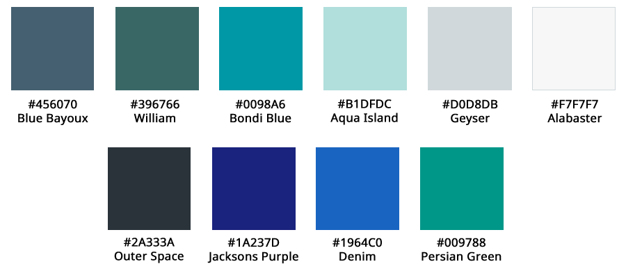
Orange and yellow were used to highlight key features and functionality--compose button (orange) and differentiating unread emails from read emails (yellow).
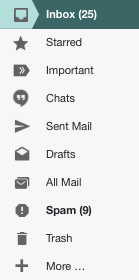
Green, red, yellow and gray were primarily clustered in the lower left hand contact window to help indicate contact availability more visibly. The purpose of switching out the profile picture to colored availability indicator, was to maintain a level of consistency within the panel and make a more obvious indicator of contact availability. Although the profile picture is more unique to each contact, I wondered if the noise of colors and pictures in profile pictures took away from the ease of determining a contact’s availability.
Padding
For the most part, I tried to stay relatively close to the current padding in Gmail as it seems reasonably designed. The areas that I did change were adding spacing between
Branding
In addition to attempting to communicate brand through colors, I concluded that Gmail is a relatively established brand/product that can stand alone by their trademark logo. So the written out Gmail button on the top left hand side was replaced with the logo. Since visuals can be quicker to internalize, this logo should get the point across while easing the need to read.
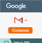
However, you’ll notice the Google logo at the top left corner does not follow the same standard. Since the logo is seen in various forms and colors, I purposely kept that logo white to keep the focus within the email window. Using the branded color would have been too much of a distraction. Keeping the same font and general look still convey’s the brand.
Gmail icons that might be less known, but relatively unique to Gmail’s application were added to the left hand menu. This served to reinforce iconic idioms associated to their function, with the help of words. It is also a relatively quicker way to identify those filters with frequent and intermediate usage.
Communication of specific information
For the most part, I’ve used colors to help with navigation and communicate purpose. Some additional considerations in my design are
Navigation
within the email panel and lower left frame using colored tabs. To assist the user in knowing which tab they’re in, the active tab is colored differently than the inactive ones. To further communicate that, a line along the border of the set of tabs is added, using the same color as the active tab.


Contact availability and identification
I was a little torn in deciding whether or not to keep the current format, as profile pictures are definitely more distinguishable from contact to contact. Since this is practice, I decided to try something new. The result is a modification of the current contact icon, if no profile picture is present.


Before working on this exercise, I didn’t have any strong opinions of the Gmail interface in regards to visual design as it was relatively clear for my usage. As a user, it wasn’t always apparent what changes, if any, can be made to improve the product’s usability. By taking the time to think like a designer to find ways of improving Gmail’s interface, I realized there were features that I was unaware of and potentially how that was linked to visual design.
The lower left hand panel, for example, is something I never paid much attention to. As a result, I never considered the option of optimizing it for my use. Once I paid attention to this area in my exploration, I realized what I’ve been missing out on. As a result, my solution took a bolder approach to the tabs in order to communicate a more obvious affordance to it’s usage.
Colors were a fun aspect that I struggled a bit with in this exercise. In past experiences, I’ve seen brand guidelines that have dictated the direction of visual design in products and communication--usually consisting of a concise set of colors. It seemed manageable to replicate this until I started thinking through my own set for this exercise. So many questions filled my mind. What does the color emote? What’s the best way to differentiate one area from another? Does this reflect branding? After seeing the final variety of colors I tried to incorporate in the end, I realize now how much more there is to learn. The mastery of color is not as easy as it looks and requires a good understanding of color, how it is perceived and the right balance for effective use and communication. This is an area that I look forward to spending more time learning to help me in future design work.
By starting to put what I’ve learned about design into exercises like this, I’ve found an appreciation to the intricacies of incorporating the numerous visual design considerations to an interface. I now see why visual design can be so specialized. There is a lot to think about on how to communicate information purposely, but also understanding the details of how unique properties in shapes and color is perceived by users. There is no doubt how important the role of visual design plays in interaction design.